By
Justin Wong
—
How to Make a Poster Presentation That Gets Noticed

Justin Wong
Head of Growth
Graduated with a Bachelor's in Global Business & Digital Arts, Minor in Entrepreneurship
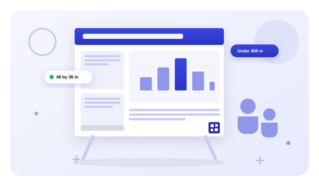
A poster session is a long room, a moving crowd, and forty boards competing for the same pair of eyes. Yours has about three seconds to earn a stop.
Six steps, in the order you should actually do them, which is not the order most people work in. Sizes first, type second, words last.
<CTA title="Turn a finished paper into poster content" description="Jenni can condense a section into a few short lines while keeping the citation attached to the claim." buttonLabel="Try Jenni Free" link="https://app.jenni.ai/register" />
What a poster session actually looks like
Rows of boards, people walking at conversation pace, and roughly two seconds of peripheral attention per poster before someone decides whether to turn their head. The board is not a paper on a wall. It is a signal designed to interrupt a walk.

Step 1. What size should a research poster be?
Before anything else, because the printer cannot fix a board that does not fit the space. Conferences set this and they are specific about it. ASCO requires landscape, no larger than 77 inches wide by 48 high. The American Society of Hematology provides a board roughly 4 feet tall by 6 feet wide.
Where you have a free hand, these are the common sizes.
Size | Inches | Millimeters | Typically used for |
48 by 36 in, landscape | 48 × 36 | 1219 × 914 | The standard United States research poster |
A0, portrait | 33.1 × 46.8 | 841 × 1189 | Most European and international meetings |
A1, portrait | 23.4 × 33.1 | 594 × 841 | Tight booths, student sessions, easier travel |
36 by 24 in, landscape | 36 × 24 | 914 × 610 | Symposia and departmental days |
The mistake this step prevents
A landscape poster on a portrait board. There is no fix at the venue, and it happens every year because people design first and check second.
Step 2. Set the type sizes before you write the content
Bigger than feels natural, because you are designing for someone standing several feet back rather than sitting at a desk. Fix these numbers now and the word count takes care of itself.
The three sizes that matter
Title: 72 point or larger. ASH asks for lettering no less than 1.5 inches high.
Section headings: 36 point or larger.
Body text: 24 point or larger, more if the layout allows.
Those come from Temple University Libraries, which also puts the standard poster at 48 by 36 inches.
How far away should it read?
Institutions disagree, and the range itself is the useful information. Temple says 5 feet. NYU Libraries says important information should read from about 10 feet. Oregon State University Libraries gives 6 to 10 feet. ASH tells presenters illustrations must be legible from at least 3 to 5 feet and warns against normal typewriter size type of 10 to 12 point.
Design for the far end of that range. A poster readable from 10 feet is also readable from 5.
<ProTip title="📏 Readability test:" description="Print one section at actual size on a single sheet, tape it to a wall, and walk six feet back. If you lean in to read it, the type is too small and no layout will fix that." />
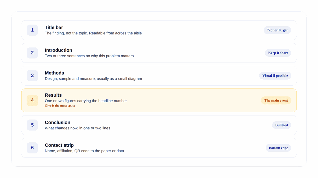
Step 3. Lay out six blocks in one reading path
A stranger should be able to follow the board without asking you where to start.
The block that does the work
The title. State the finding, not the topic. "Weekly quizzing raised course completion by seven points" beats "An investigation into retrieval practice" because one of them can be read at walking pace and understood.
The block to cut first
The introduction. Two or three sentences on why the problem matters, and it is the first thing to sacrifice when you run out of room. Nobody stopped at your board for the background.
The remaining four
Methods. Design, sample and measure. A small diagram usually beats a paragraph.
Results. One or two figures carrying the headline number. The most space on the board.
Conclusion. What changes now, in one or two bulleted lines.
Contact strip. Name, affiliation, and a QR code to the paper or the data.
Step 4. Give the figures half the board

The MIT Communication Lab suggests roughly half the poster should be figures and charts. Treat that as a constraint rather than a suggestion: if your layout cannot reach it, you have too much text.
Pick your single best figure and make it the largest thing after the title. If you cannot choose one, you have not decided what the poster is about. And resize the type inside any figure lifted from your paper, because an axis label set for a two column article is illegible at poster distance.
<ProTip title="🖼️ Give figures room:" description="Export figures at the size they will print, not the size they were in the paper. Scaling a small figure up on the poster template is the fastest way to a blurry board." />
Step 5. Cut the words to under 800
Temple puts the total between 600 and 800 words. NYU and Oregon State both give 300 to 800. What all three agree on is the ceiling, and almost every first draft is over it.
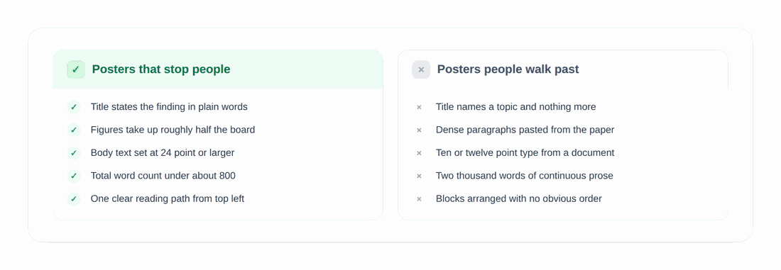
Boards that stop people state the finding in the title, give figures half the space, set body text at 24 point or larger, keep under 800 words, and offer one clear path from the top left. Boards people walk past name a topic, paste dense paragraphs from the paper, keep 10 or 12 point type, run to two thousand words, and arrange blocks with no obvious order.
<ProTip title="🎨 Contrast check:" description="View your poster in grayscale before you print. If two data series become indistinguishable, so will they under conference hall lighting." />
Step 6. Rehearse three versions of the pitch
The board starts the conversation. The conversation is where the value is, so prepare for it with the same care.
Ten seconds. One sentence: what you found and why it matters. This is the version you use most.
One minute. The question, what you did, the headline number, the implication.
Five minutes. Walk the board left to right, and stop talking at the results so they can ask something.
Prepare answers to the two questions you least want: the sample limitation and the obvious confounder. Being ready for those is the difference between a defensive exchange and a good one.
<ProTip title="🎤 The 30 second pitch:" description="Write your opening sentence out and say it aloud twenty times before the session. When someone stops unexpectedly you want that line automatic, because the first ten seconds decide whether they stay." />
What the evidence actually says about posters

Less than the effort suggests, and it is worth knowing before you spend a week. A review in Health Information and Libraries Journal examined the evidence that posters promote knowledge transfer and found they work best when integrated with other educational modalities rather than standing alone, concluding that better comparative studies are still needed.
The practical reading is not that posters are pointless. It is that the board is a conversation starter, so design for the exchange rather than for completeness.
The abstract that gets you the slot
Worth remembering that the board is the second step. Almost every poster session is gated by an abstract submitted months earlier, usually under a tighter limit than a paper abstract. The APA Convention caps division poster titles at 75 characters and the session abstract at 250 to 300 words.
That abstract is what the committee scores. Our guide to writing an abstract for a conference covers the limits venue by venue, and drafting it against your own sources is faster than rewriting the paper down by hand.
Before you send it to print
Board dimensions and orientation confirmed in writing.
Title states a finding and reads at 72 point or larger.
Body text nowhere below 24 point.
Figures occupy roughly half the board and were exported at print size.
Total word count under 800.
QR code scans from two feet away.
One section printed at actual size and checked from six feet.
Design for the Person Standing Six Feet Away
Every rule here comes from one constraint: the reader is upright, moving, and deciding in seconds. Large type, half the board given to figures, under 800 words, and a title that states what you found. Get those four right and the layout mostly takes care of itself.
<CTA title="Get the abstract that wins the slot" description="Draft and tighten your poster abstract in Jenni, with the sources from your paper attached to every claim." buttonLabel="Draft My Abstract Free" link="https://jenni.ai/conference-abstract-writer" />
Before the session, do one last pass on the science rather than the design. A review check catches the overstatement a colleague will ask about while you are standing there, and our guide to reporting results covers how to phrase the numbers on the board.