By
Justin Wong
—
Positive vs Negative Correlation in Research: Meaning & Examples

Justin Wong
Head of Growth
Graduated with a Bachelor's in Global Business & Digital Arts, Minor in Entrepreneurship
A correlation shows how two things change together. If they rise and fall together, it's a positive correlation. If one goes up while the other goes down, it's negative. This relationship is measured by a correlation coefficient, a number between -1 and +1.
The direction and strength of this link are crucial for drawing accurate conclusions from your data. Misinterpreting it can invalidate your findings. We'll look at real examples, the tools used to calculate it, and the most frequent errors researchers make. Keep reading to learn how to spot and use these patterns correctly.
<CTA title="Make Correlation Easier to Explain" description="Use Jenni to turn rough research notes into clear academic writing." buttonLabel="Try Jenni Free" link="https://app.jenni.ai/register" />
Understanding Correlation in Research
Correlation in research shows how two variables change together. It never proves cause and effect. It simply shows if two things move together, move apart, or aren't related at all.
The strength of this link is measured by the correlation coefficient, r. This number falls between -1 and +1. To better understand how the correlation coefficient ranges between -1 and +1, you can explore a detailed explanation in this correlation coefficient guide.
If you're exploring how correlation fits within broader study approaches, you can also review research paradigms, which explains how different research frameworks influence data interpretation.
A score close to +1 or -1 means a strong link. A score near 0 means there's little linear connection. The core idea remains: correlation describes a pattern, not a cause.
Researchers use correlation for several practical reasons. It helps detect trends before committing to costly experiments.
This tool helps you spot patterns, predict future trends, and simplify complex data into clear insights. It’s also great for creating theories and making messy information much easier to manage.
<ProTip title="💡 Pro Tip:" description="Always plot your data before interpreting correlation values. A quick scatterplot can show patterns that a single number might hide." />
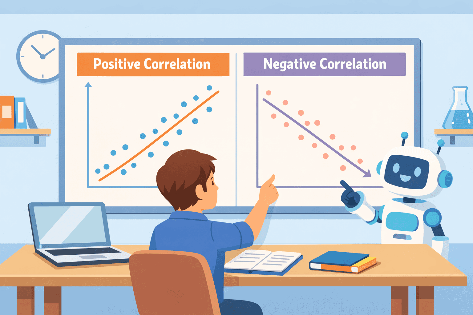
Positive Correlation Explained

Positive correlation means two things move together. When one goes up, the other goes up too. When one goes down, the other follows. For example, studies show that people who exercise more usually feel better mentally.
On a scatterplot, this relationship creates an upward trend. The data points cluster along a diagonal line rising from left to right. You see it in common pairs like study time and exam scores, or exercise frequency and fitness results.
Income and education level also typically show this pattern. Statistically, a strong link might be an r value of +0.8, while a moderate one could be around +0.4.
In practice, a positive relationship usually points to shared growth or reinforcing factors. But it’s often misleading. Take summer: ice cream sales and drowning rates both increase. The real cause is the hidden variable, hot weather, not a direct link between ice cream and drownings.
<ProTip title="💡 Pro Tip:" description="A positive correlation means two variables move together, but it does not prove that one variable causes the other." />
Negative Correlation Explained
Negative correlation describes an inverse relationship. As one variable increases, the other reliably decreases.
Data from public health organizations, like the CDC, often show this pattern. For example, certain health risk behaviors negatively correlate with life expectancy outcomes.
On a scatterplot, you see a clear downward slope. The data points fall as you move from left to right across the graph. Real-world examples are easy to find: higher stress often means worse sleep quality.
Driving faster reduces fuel efficiency. More study distractions typically lead to lower academic performance. Statistically, a strong inverse link might have an r value of -0.7, while a weak one could be around -0.2.
These inverse relationships are practical. They highlight trade-offs. If one factor goes up, you can predict another will likely go down. This insight is valuable for making decisions in fields like healthcare or economic policy.
<ProTip title="💡 Pro Tip:" description="A negative correlation is useful for spotting trade offs, risk factors, and inverse relationships in research data." />
Strength and Interpretation of Correlation Coefficients
The correlation coefficient tells you two things: the direction of a relationship, and its strength. A value near +1 or -1 means a strong link. A value close to 0 means a weak one.
Here’s a common way to interpret the strength:
Correlation Type | Value Range | Strength | Example |
Positive | +0.8 | Strong | Study time vs grades |
Negative | -0.6 | Moderate | Stress vs sleep quality |
Zero | 0.0 | None | Hair color vs intelligence |
A weak relationship falls between 0.0 and ±0.3. A moderate one is from ±0.3 to ±0.7. Anything from ±0.7 to ±1.0 is considered strong.
If you get a correlation of zero, it means no straight-line relationship exists between the variables. Other, more complex patterns could still be there, but the linear correlation is absent.
<ProTip title="💡 Pro Tip:" description="Check both direction and strength before interpreting a correlation result. The sign shows direction, while the value shows how strong the relationship is." />
Correlation vs Causation: Common Mistakes

Correlation does not prove causation. This is perhaps the most frequent error in interpreting research.
Health organizations say this confusion can make people misunderstand health information. Two variables can move together without one directly causing the other.
This happens because of spurious correlations. A third, hidden factor drives the changes in both measured variables. You can see several surprising examples of these misleading relationships in this collection of spurious correlation examples.
To better understand how correlation is used as a research method itself, you can explore correlational research, which explains how these relationships are studied systematically.
Classic examples include the rise in ice cream sales and drowning incidents during summer, the real cause is hot weather, not ice cream.
Another example is kids’ shoe size and reading skills, they seem related, but it’s really because older kids have bigger feet and read better.
The same goes for coffee and productivity. It might look like coffee makes people more productive, but it could actually be their morning routine or how well they slept.
Misreading these relationships carries real risks. It can invalidate a study's design from the start. Researchers might overestimate the importance of a weak link.
They can completely ignore a lurking variable that explains everything. In applied fields, this leads to misguided policy decisions based on faulty assumptions. It also results in weak predictive models that fail in real-world use.
<ProTip title="💡 Pro Tip:" description="Look for confounding variables before making conclusions. A hidden third factor can make two variables look more connected than they really are." />
Statistical Methods for Correlation Analysis
The method you choose for correlation analysis depends entirely on your data. Using the right one makes your findings more accurate and easier to interpret.
Before running correlation tests, it's important to clearly define what you're investigating. If you're unsure how to frame your study, this guide on how to write research question can help you build a strong and focused research direction.
Two of the most common methods are Pearson and Spearman correlation.
Pearson correlation measures a straight-line relationship between two continuous variables. It's the standard choice in many experimental studies.
Spearman rank correlation doesn’t need a straight-line relationship. It just checks if values generally go up or down together by comparing their order, not the exact numbers. It's often used for ordinal data or when the relationship isn't linear.
If you want a deeper understanding of how this works, you can read more about Spearman rank correlation methods.
Method | Best For | Data Type |
Pearson r | Linear relationships | Continuous data |
Spearman rho | Ranked or non-linear trends | Ordinal data |
So, when should you use each? Pick Pearson if your data is normally distributed and you expect a linear link.
Choose Spearman if your data is already ranked, heavily skewed, or you suspect a non-linear but monotonic pattern. Sometimes, running both tests can check the robustness of your result.
<ProTip title="💡 Pro Tip:" description="Review outliers before using Pearson correlation. A few unusual values can make the relationship look stronger or weaker than it is." />
Real-World Applications of Correlation
Correlation isn't just a statistical concept. It's a practical tool used in nearly every field to spot patterns and steer decisions.
In psychology and health research, it helps map connections between behaviors and outcomes. Studies often check if stress and anxiety go together, or if better sleep is linked to better thinking and focus.
The relationship between regular exercise and improved mood regulation is another common focus.
Economists and business analysts rely on it to predict trends. They look at how income affects spending, or how interest rates are related to investment growth. Marketing teams analyze how advertising spend correlates with sales performance.
Education researchers use it to evaluate what works. They look at whether students who attend class more often do better in school, or if studying more leads to higher test scores.
It also helps assess whether new teaching methods correlate with higher student engagement.
Checklist for Interpreting Correlation Correctly
To avoid mistakes, follow a clear checklist when interpreting correlation.
Step-by-step interpretation guide
Identify direction (positive or negative)
Check strength (weak, moderate, strong)
Visualize data using scatterplots
Test statistical significance
Look for confounding variables
Avoid causal assumptions
Common interpretation errors
Common errors happen when context is missing. Researchers sometimes ignore outliers that skew the results. They overgeneralize findings from a small or specific sample.
The classic error is confusing association with causation. Another technical mistake is using the wrong statistical test for the type of data you have.
<ProTip title="💡 Pro Tip:" description="Use a scatterplot before finalizing your interpretation. Visual patterns can reveal issues that the correlation number alone may miss." />
Make Correlation Work for You
You’ve probably stared at data that looks connected but still feels unclear, wondering if it actually means anything. It’s frustrating. Numbers alone don’t explain themselves.
<CTA title="Turn Data Patterns Into Clear Writing" description="Use Jenni to explain research findings with more structure, clarity, and confidence." buttonLabel="Try Jenni Free" link="https://app.jenni.ai/register" />
That’s where a tool like Jenni helps you move faster with more confidence, turning patterns into clear statements you can use right away. It’s a simple step that saves time and avoids second-guessing.